Since the pitch progress has been jumping backwards and forwards. I swore I'd never draw another storyboard frame again, but here I am, after draft four of the script and its time to grace the Wacom tablet with my draftsman's touch once again. So that's what I'm psyching myself up for on monday, Olly vs Narrative, Round IV: Fight!
Until then I've been busying myself with visual distractions in the name of sanity, satisfaction, and R&D. Ironing out all the technological challenges now is going to pay off massively down the road, so I started with a simple one: cheating translucency in leaves.
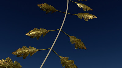 |
| Front Lit |
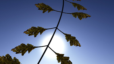 |
| Back Lit |
Hopefully if you enlarge the images you'll get a sense of how the light illuminates the fabric of the leaves whilst not passing through the thicker veins within each leaf. This was achieved using a simple blinn shader with a specific texture plugged into the translucency value to control light transmission through the leaf. I set the translucency focus to 0.750 meaning any shadows that land on the leaf scatter slightly though it giving a softer more organic look.
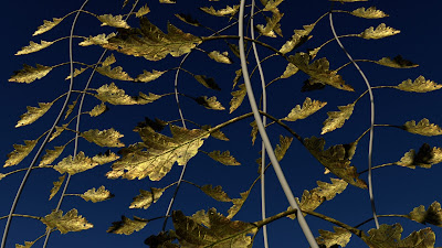 |
| Front Lit |
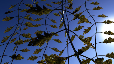 |
| Back Lit |
I'll be replacing this mouldy brown leaf texture (that I found from a photo I took for Art AS years ago) with some nice Ivy leaves I picked on my home from the cinema this evening.
I've also just today started doing some preliminary lighting for Fentil: Another Life today and damn does it feel good to be illuminating things again. I even found a way to calculate ambient occlusion using existing final gather information in a render. This takes mere seconds and is more accurate is some ways, whilst less detailed in others. SUPER EXCITING. Have a shiny:
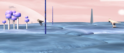 |
| Noon |
I started with the standard mental ray sun and sky, and then used the sky image's incandescence value to create a softer lighting effect, combined with the new final gather ambient occlusion you have a ridiculously efficient, pretty simple lighting setup. As more assets get created I'll hopefully get to tweak shaders and things earning my title as look development, and not just a mere lighting monkey.
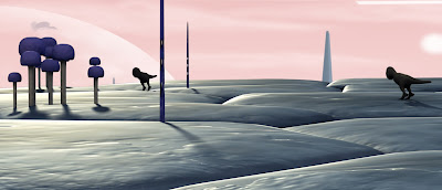 |
| Sunset |
The colour palette here is the closest I could match to the original wow image with its pastel purples pinks and blues. Its tricky striking a balance between crushed and over-saturated colours, and washed out bland colours.
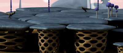 |
| Afternoon |
Can't wait to see this stuff when the dynamics guys stick some atmospherics in there ans slap some depth of field on, cinema verite, viola!
Pixel Propaganda
Uncharted 3 is fantastic for what it is. And few have said that what exactly that is better than
here.
The
best reason to be excited for Skyrim.
More fantastic words coming from the brain of Richard Lemarchand,
here he talks about the barrier between emotive games and game developers.


No comments:
Post a Comment
Let The Discussion Begin: