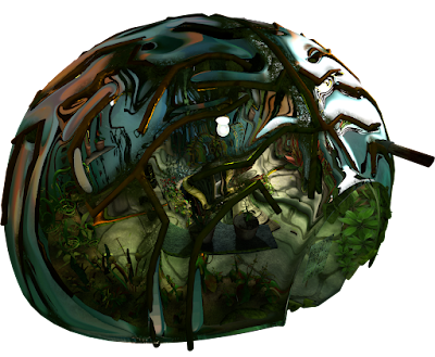
 |
| The Greenhouse, From The Outside |
Final lighting for the greenhouse is complete as seen above from both the exterior, and below from the interior:
This is one of those old blog posts, it sits in the drafts section getting a bit stale, its still tastes good but the texture isn't as fresh as it once was and you're not quite sure which tense to write it in now, two weeks since the last post.
Team Kernel made a city. It doesn't have a name but its in keeping with the Kernel visual style, conveys the oppressive and ubiquitous theme of ignorance, and the majority of it was in fact modelled and textured by our faithful second year
Sebastian. Since he completed it I've been going through tweaking the textures very slightly, creating reflection maps for the windows, and applying shaders to it before I could light it.
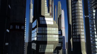 |
| Shiny Window Shaders |
I started with the same workflow as the greenhouse with a final gather sphere, and this time a directional light. The colours from the sphere were overly green though, while I like the effect, its not contrasting enough to the greenhouse. Also its hard to tell anything for sure without the atmospherics and smog in the scene.
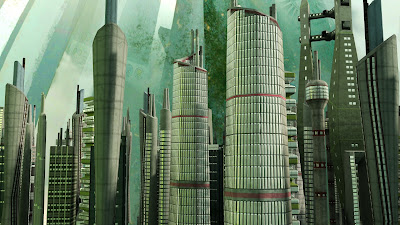 |
| The Greenhouse Effect |
I tweaked the final gather incandescence map to create a more neutral colour palette but lost too much of the character of the environment so opted to create a more controlled incandescence map. I wanted to create a bright spot in the center for the sun and have that tail of into the darker edges of the city. What I ended up with is this bluer, smudgier, more focused lighting map:
 |
| Final Gather Incandescence Map |
The city is really simply lit scene, by far the quickest I've made, but still pretty slow to render once I added the smog
Alan made which has raytraced shadows through it. There are just some really simple point lights filling out the hollow buildings and a spot and point light combination illuminating the frame buildings to highlight the architecture.
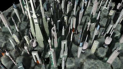 |
| ...On Rock & Roll |
I'd neutralised the colours of the final gather and sunlight at this point, but it just lost all sense of atmosphere. Getting the sunlight onto the smog was tricky because I had a mental ray physical sun shader on the directional light to create quicker soft shadows on the buildings, which worked great, but this meant that it would work with the fluid. So I separated out the smog onto a separate render layer and created a layer over-ride that made the directional light ignore the physical sun shader and just do a simple raytrace shadow. But this didn't create the correct shadows until I'd made a duplicate city, that was invisible, but still casted shadows. After this elaborate work around it turned out fine.
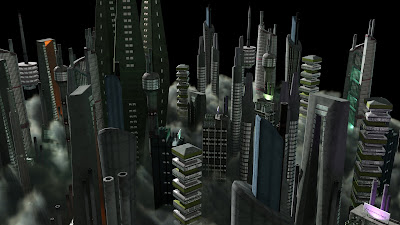 |
| Billboards have they're own dedicated spot lights. |
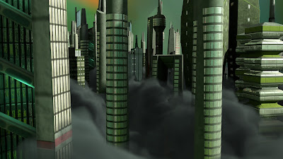 |
| The Smog of Ignorance |
Now that all the assets have been generated for Kernel, all the sets, props, dynamics most people have moved onto animation. This means that instead of our
one man animation army we have at least 7 animators at the moment, progress as absolutely blitzing and I can barely keep up with lighting each shot, its fantastic! We have every shot accounted for by an animator for two thirds of the film. It just go to show that there comes a tipping point in every project where all the manufacturing of pretty things is completed, allowing the actual film making to start, the performance, lighting, and rendering of each shot. Morale seems to be up, productivity seems to be up, at this rate we're going to finish with something not only pretty, but quite substantial. Have a render, click to enlarge:
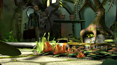 |
| Leonard Enters The Greenhouse |
Apparently I wrote a dissertation in my down time, no big deal. I even made a front cover for it which just reminds me of when I went to a Steiner school and there was a lot of emphasis in taking pride in your work and the presentation of it. I wanted to illustrate the main argument pictorially so I made a triangle of game mechanics (cogs), ideas (lightbulb), and the thoughts and feelings they generate (brain/heart). It would be awesome to get this published somewhere but I'm not sure how to go about doing that. Maybe I'll post it on the blog in chapters, or smaller installments, but I don't know that anyone would actually read it.
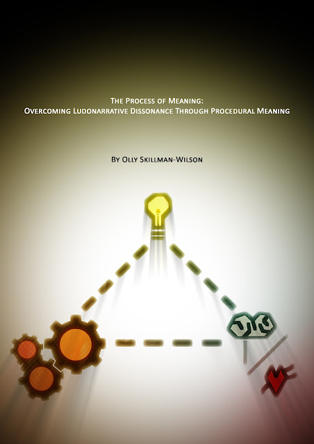 |
| The Process of Meaning |
Pixel Propaganda
Frictional games, creators of the excellent
Amnesia: Dark Descent, often have interesting things to say about game design. Thomas Grip here talks about
their approach to game design and how its unconventional, it seems like its most definitely the best direction games could be going in.
He crops again in this interesting gamasutra article on
storytelling in games which also features the writers of Portal 2.
I love Braid, I love Jonathan Blow, and everyone should always listen to everything he says because hes always right. While that may not be true, its the feeling I get
when I hear him speak, all his design philosophies come from the right places.
Autodesk released a bunch of talks on their youtube channel and this one was actually given by a student and some of the points he made were particularly familiar to our work on Kernel. Especially the emphasis on each team member filling multiple roles over the course of production.
There was another talk on the lighting in Killzone 3 and a part about the use of volume lights, something I'm not used to using which seemed to work really well and was very interesting.
Quantic Dream, the studio behind my favourite game of 2010
Heavy Rain recently released a short film which doubles as a tech demo for their new game engine. I'm excited for whatever they do next from a design perspective, but graphically, having moved to PC, this looks dated in comparison.
P.S. Happy 30,000 views to The Pixel Crush.


No comments:
Post a Comment
Let The Discussion Begin: