Lets try something new:
I'mwaytoobusytowriteablogpostsoinsteadImgoingtouploadallmytestrendersforyoutoenjoywithminimalprose
I'd somehow forgotten about my awesome lambert lighting workflow, its so fast, I love it!
Plus it looks so gorgeous its almost a shame that all that colour gets absorbed by the textures in the final render.
The beauty of final gather, in this sequence the use is minimal and its almost more of a glorified and accurate ambient light. But much slower. Though I have started playing with the min and max radius settings which control the area and therefore speed of the final gather. Above is before, below is after.
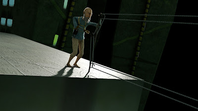
These renders are from ages ago. I couldn't figure out how to make this exterior shot look better and you know what always makes things better?...
...rim lights, they emphasise outline and form. and help Leonard stand out from the background, these are special rim lights that only effect Leonard and nothing else in the scene.
Even from a distance they work well. (Enlarge to see them working well).
After referencing in all the props and sets this scene still look worringly bare, so we got our trusty 2nd year Sebastian to jump on it and conjure up some details for the top of Leonard's skyscraper, with limited time he managed to generate some models, and faithful Ryan completed the task admirably with textures, prop placement and cleanup.
Just when I thought I was done with the greenhouse...
Another sneaky trick in lighting is to create a light that only emits specular (shiny) light rather than diffuse (soft) light, and then attach it to only the eyes of a character. This allows you to create lots of tight highlights that bring out that glistening, alive look, in a character's eyes. As seen below (enlarge to see below).
I was being useless with my feedback for a particularly tricky shot to comp so I made this as a template for the city composites, to communicate the visual style I had in mind. It still amazes me what you can do to a plain render with compositing. God rays, lens smut, and lens flare save the day.
Pixel Propaganda
Richard Lemarchand, a great game designer whose words made into into my dissertation, recently left Naughty Dog after working on the Uncharted games. He's gone to teach, travel, and make experimental games. I want to go with him.
The guys at Digital Domain made a making of for real steel and the use of Vray renderer in it. Its really cool, some great breakdowns, and a lot of talk about the est features of Vray, makes me wish mental ray had them.
Creative director at Irrational Games, Ken Levine always has interesting things to say about writing for games, mostly because they way he writes for them work so well with the medium, despite coming from a cinematic background.
I still can't quite believe several things about this trailer. Firstly its running on proprietary technology, secondly that its realtime, thirdly that it was made by 2 people, and lastly that the game its promoting actually sounds legitimately interesting. Very very exciting.
Also legitimately exciting: when people who write interesting things about games fling down their pen and exasperation and go and make them themselves. Nels Anderson wrote a great blog and now he's a gameplay designer at Klei working on Mark of the Ninja. Which looks like an awesome, intensional stealth game, where all the games systemic elements are visually represented to maximise player understanding and agency.


No comments:
Post a Comment
Let The Discussion Begin: