Getting the neurons done on time for the brain documentary was tough, I think in the end I created this shot in 3 days, which is good because I wasn't away from Kernel for too long and I made the deadline. The first day was for modeling which was really basic, I only really created one neuron and then a lot of pathways. I then duplicated these and modeled the pathways to join up. Getting the translucency to look right was also tricky and I think what in the end caused surprisingly long render times for such a simple scene, though granted, one with a hell of a lot of polygons in it. actually now I think about it I think there were about 452 lights in it too. The shader was a mia_material, because I love them. I should have put textures on them but time was short and UV unwrapping that geometry would have been a complete bastard.
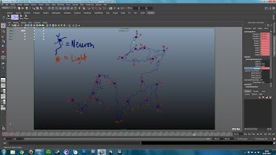 |
| Complete with Legend and everything. |
This is the model of the neural pathways. Because I didn't use curves to model this (probably a mistake) I had nothing to use to animate the lights along, the lights which would represent the pulses of thought down each pathway...or something. This meant I had to do it by hand and so all 113 lights were animated leaving a neural hub, dispersing and diverging until they reached a new one, and then that would trigger that hub to disperse its one lights. One thing I really struggled with was making a camera move that didn't cringe with its CG-ness. A lot of the medical animations of this kind of thing not only look awful, but move terribly, using that classic floaty CG fly through movement to sickening effect. In the end I decided on a simple pan up, which made the neurons look like the roots of a tree, and then spiraling outward to reveal the whole lot of them. This worked well but, as Adam pointed out, moved to fast, meaning he had to re-use a part of the shot. One I had these lights animated I fully planned to to duplicate it again but duplication doesn't retain animation keyframes so I had to reference the same scene into a new scene four times to retain all that animation.
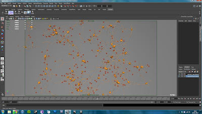 |
| Neuron Cluster |
Thank god for Maya 2012's new viewport 2.0, the framerate was buttery smooth even with all those objects. I used a render of the neurons to take into photoshop and create a background that gave the illusion that this was just one cluster out of hundreds and applied that to a sphere surrounding the entire scene. It kind of works, but only when blurred to hell. They look kind of like glowing magical fruit...
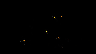 |
| Close |
 |
| Mid |
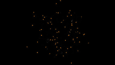 |
| Far |
And the final rendering and composite:
Now that
Charlie has done a sterling job on the storyboarding and the animatic, me and
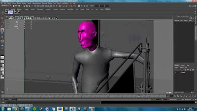
Hugh have begun the block through- this is basically layout but for 3D as far as I can tell. We do some key poses for Leonard, and then put the camera moves in for a scene, following the animatic as closely as possible. Here's a sneak preview:
 |
| Gorgeous I know. |
Something I stumbled across on a
CG talk forum was a new feature in mental ray called unified sampling. It is super awkward to find as you have to run a script just to reveal it in a panel that is hidden by default. But, its worth it because after struggling to get soft depth map shadows to look good (they don't), I used the three same area lights with raytrace shadows to achieve much better, but unacceptably grainy effect. What unified sampling does is overrides the number of samples on anti-aliasing, shadows raytracing, and glossy reflections and unifies them. Using a magic algorithm it then samples only what it needs to using one quality control value that means I get 3 soft shadows for only a minute more than awful shadows. I then got carried away and rendered at 4k resolution for the first time. Click "Original" in the quality settings on the youtube video to see that crazy detail. Almost looks like a stop motion model. It makes 1080p look blurry by comparison, my renderine threshold has been raised.
I apologise for all the jargon in this post, hopefully there's enough shiny to compensate. Its not reader friendly but hopefully somebody learnt something.
Pixel Propaganda
Here's a cool,
western styled animation with a style similar to what I want to aim for with Kernel, both in terms of animation and aesthetic. Plus
making of.
I read an article on
the lighting in Tintin and the development of Weta digital's lighting engine with a hilarious name. Pantaray or something.
MGS3 is regarded by some as the greatest Metal Gear Solid game and after reading this piece reminding me
how incredible the boss battle with 'The End' is I can't help but agree.


No comments:
Post a Comment
Let The Discussion Begin: