The weeks go by so fast that its hard to know what I did and when I did it.
This week we moved production into the studio which was pretty awesome. Not everyone is always in, but the people that are can communicate with each other and solve production problems much quicker. I get almost nothing done as (literally) every 60 seconds someone has something to show me or a question to ask, and its BRILLIANT. I love it, I can direct people properly, giving feedback, getting their suggestions and ideas. Being able to monitor people's progress allows me to help them do their job better (or be their pain in the neck) but it also means I'm painfully aware when work isn't being done.
The blockthrough continues as me and Hugh lay out each shot's camera move with its accompanying poses for Leonard, we're rapidly closing on the final two mighty scenes. It's going to be interesting. It's essential, I now appreciate, as this way we are forced to notice the flaws in each set and set it up to be production ready, scale, translating, referencing so every prop, texture, effect, and light is in the right place doing the right thing.
Dan has even started animating with a sweet shot of Leonard leaving the shed and entering the greenhouse, before he processes the thought cloud into mulch for the tree. Our production target as set by Rosa is to get a render out of that animated shot by this Friday's presentation. She suggested a test render but if we can get that corner that's in shot textured, which is totally possible with
Nigel now king of the textures, then I feel it would make sense to push it that extra bit further and stretch for a final render. Obviously using the word final curses it but I don't see why it couldn't be final. Hence me jumping back on the lighting, just try and stop me, I Am The Light...Mwahahahah!
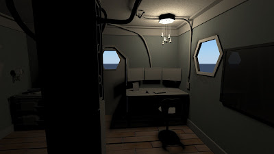 |
| Mmm....Perhaps not |
Yeah. I forgot how to light, Shame. After a few more attempts it started coming together, using only depthmap shadows (uber-speedy for the rendering). I had to go into all the prop scenes and delete all the duplicate sun and sky nodes along with all the fur attributes because I'll be damned if I'm going to use that mental ray crutch forever, it felt like it was about time stopped using physical sun & sky and relying on it. Plus its quite tricky to break out of its default look when using it as a starting point. and its not the quickest of lighting setups when working on an interior.
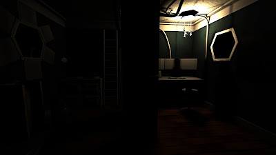 |
| Better, Closer, Warmer... |
With depth map shadows, I've found so far that the 'regular shadowmap' setting in the light attributes provides this soft faux ambient occlusion effect that I much prefer over the 'detail shadowmap' option which only looks less detailed to me but that might just be to do with this scene. I could never for the life of me figure out how a soft depth map shadow could appear grainy but I finally found the samples section under the mental ray overrides. Smooth as you like now.
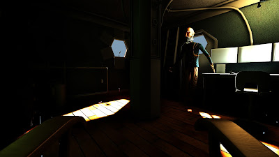 |
| Leonard Even Turned Up To Watch. |
Instead of using a standard directional light for the sunlight coming through the portholes I set up two spotlights so that I could control the angle of each light individually, this way more light is coming in and while its not physically accurate its more cinematic and shiny. I was talking with Charlie about how the colours are a bit busy, too much colour variation, and either we'll need to unify the textures more, or de-saturate the lights, or be very cunning with colour grading during compositing. I'm guessing it'll need all three.
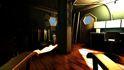 |
| Grappling with Exposures |
Also rubbing final gather all over everything boosts those same colours in very lovely ways, note the bounce lighting on the underside of Leonard's stool for example. But it also adds a good 2 minutes render time at least, this is not too much of a problem though as it will only have to calculate it for the first frame and merely add to it for each subsequent frame of a sequence.
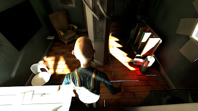 |
| Beginning To Look Homely. |
In the name of this colour study here is a before and after comparison with the textures.
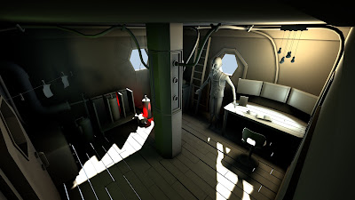 |
| Lambert only |
The green tinge on the centre column is me trying to give the feeling of a green light coming from the greenhouse through the porthole just off screen to the left.
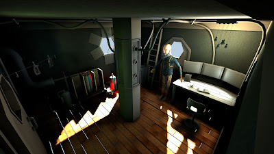 |
| Textured |
Rendering the textures too adds almost exactly a minute to render time which seems wholly acceptable, I reckon we'll keep them...
Much as I completely adore final gather these test renders are reaching a level of softness without it that makes me think if things got really dire
we could forego it but only if it was really really necessary.
I've also finally given Leonard shaders for his mouth. His tongue is now pink and teeth a pearly white. Tweaking the textures for Leonard's feet and face were also on my list of final changes for him as my secret scrutiny committee had noticed he had no lips in his texture, also that his feet should be dirty if he never wears shoes. I made these changes and then figured I should finally apply the shaders to the rig. Problem: the UVs had changed since rigging commenced. This meant a ridiculously convoluted method of applying the new UVs to the shapeorig node in the hypershade, therefore allowing me to delete history on them without removing them from the bind. It worked beautifully and the rig still worked. That is until Hugh noticed the mesh and skeleton were displaced in all the referenced scenes. Oops.
Pixel Propaganda
This is the unbelievably
useful tutorial I used to add the new UV's to the rigged mesh.
Someone made
realtime subsurface scattering look the best it has done since arkham city.
Here's a video that's been circulating recently and its just too accurate. Its hilarious.
I was reading an article brought to my attention by
critical distance: this week in videogame blogging (something everyone who is writing about games for their dissertation should subscribe to) about the different approaches to
narrative delivery in Fallout: New Vegas and Bastion.
Here's an
amazing guide to texturing which uses some very clever but simple tricks, written by the lead texture artist at double negative, who is also part of the CGconceptShare thing.
I've been using a copy of Lenscare from Frischluft which is an extraordinarily pretty depth of field plugin for After Effects. I thought it'd be great to have a full version for Kernel when we get to compositing so I emailed Frischluft hoping to maybe get a student discount off their $70 plugin. They gave me a free copy! So thankyou very much to them, they will no doubt receive a special thankyou in the credits
when we finish Kernel. Maybe we can figure out a way to sneak their logo into an environment somewhere as a homage, or would that be copyright infringement?


OOer, the bold guys eyes really creep me out on that video. Bleaurgh. Getting there though
ReplyDelete