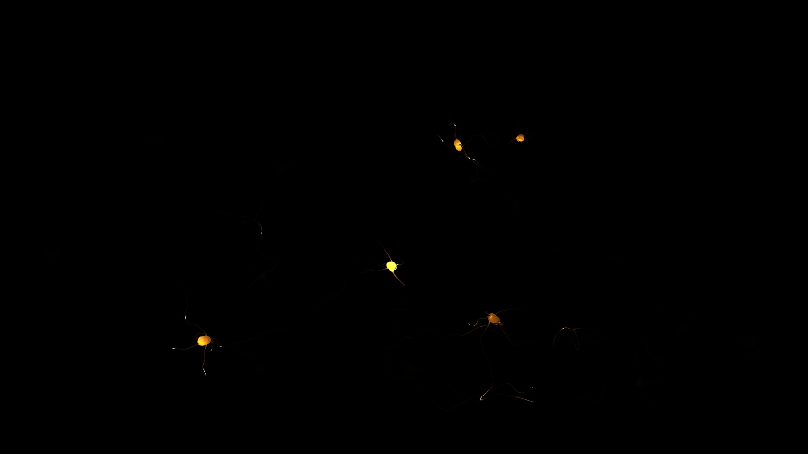
Getting the neurons done on time for the brain documentary was tough, I think in the end I created this shot in 3 days, which is good because I wasn't away from Kernel for too long and I made the deadline. The first day was for modeling which was really basic, I only really created one neuron and then a lot of pathways. I then duplicated these and modeled the pathways to join up. Getting the translucency to look right was also tricky and I think what in the end caused surprisingly long render times for such a simple scene, though granted, one with a hell of a lot of polygons in it. actually now I think about it I think there were about 452 lights in it too. The shader was a mia_material, because I love them. I should have put textures on them but time was short and UV unwrapping that geometry would have been a complete bastard.
Complete with Legend and everything.
This is the model of the neural pathways. Because I didn't use curves to model this (probably a mistake) I had nothing to use to animate the lights along, the lights which would represent the pulses of thought down each pathway...or something. This meant I had to do it by hand and so all 113 lights were animated leaving a neural hub, dispersing and diverging until they reached a new one, and then that would trigger that hub to disperse its one lights. One thing I really struggled with was making a camera move that didn't cringe with its CG-ness. A lot of the medical animations of this kind of thing not only look awful, but move terribly, using that classic floaty CG fly through movement to sickening effect. In the end I decided on a simple pan up, which made the neurons look like the roots of a tree, and then spiraling outward to reveal the whole lot of them. This worked well but, as Adam pointed out, moved to fast, meaning he had to re-use a part of the shot. One I had these lights animated I fully planned to to duplicate it again but duplication doesn't retain animation keyframes so I had to reference the same scene into a new scene four times to retain all that animation.
Neuron Cluster
Thank god for Maya 2012's new viewport 2.0, the framerate was buttery smooth even with all those objects. I used a render of the neurons to take into photoshop and create a background that gave the illusion that this was just one cluster out of hundreds and applied that to a sphere surrounding the entire scene. It kind of works, but only when blurred to hell. They look kind of like glowing magical fruit...
Close
Mid
Far
And the final rendering and composite:
Now that Charlie has done a sterling job on the storyboarding and the animatic, me and Hugh have begun the block through- this is basically layout but for 3D as far as I can tell. We do some key poses for Leonard, and then put the camera moves in for a scene, following the animatic as closely as possible. Here's a sneak preview:
Gorgeous I know.
Something I stumbled across on a CG talk forum was a new feature in mental ray called unified sampling. It is super awkward to find as you have to run a script just to reveal it in a panel that is hidden by default. But, its worth it because after struggling to get soft depth map shadows to look good (they don't), I used the three same area lights with raytrace shadows to achieve much better, but unacceptably grainy effect. What unified sampling does is overrides the number of samples on anti-aliasing, shadows raytracing, and glossy reflections and unifies them. Using a magic algorithm it then samples only what it needs to using one quality control value that means I get 3 soft shadows for only a minute more than awful shadows. I then got carried away and rendered at 4k resolution for the first time. Click "Original" in the quality settings on the youtube video to see that crazy detail. Almost looks like a stop motion model. It makes 1080p look blurry by comparison, my renderine threshold has been raised.
I apologise for all the jargon in this post, hopefully there's enough shiny to compensate. Its not reader friendly but hopefully somebody learnt something.
Pixel Propaganda
Here's a cool, western styled animation with a style similar to what I want to aim for with Kernel, both in terms of animation and aesthetic. Plus making of.
I read an article on the lighting in Tintin and the development of Weta digital's lighting engine with a hilarious name. Pantaray or something.
Previously on The Pixel Crush: "next week: sculpting!"
Sculpting!
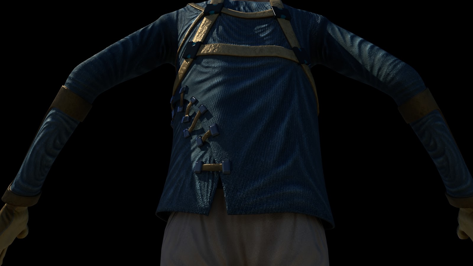
I took Leonard's newly unwrapped torso and trousers and sculpted copious amounts of folds and detail into each, slightly forsaking the original concept design in the process. The amount of folds on his otherwise quite rigid clothing gives the impression of silk draped over cardboard but I don't really care because folds are awesome.
Sculpt Front
Though Dan did point out I went overboard on his glove to the point where they looked like medical gloves rather than gardening gloves so I went back in to the sculpt, added a seam, and flattened the palms for a more practical aesthetic.
Sculpt Back
For the first time I have been experimenting with normal maps, a fancy form of bump mapping or a flat form of displacement mapping depending on your outlook on life. Or a way of adding detail to a model using a multi-coloured textures for those reading who aren't animation students/professionals. (Imagine if there were professionals other than our tutors reading these blogs...hey professionals!)
In order to generate a normal map, a technique used widely in videogames incidentally, you first need to have a high res sculpt of your base model, there are then various ways of storing the data of the surface. The 'normal' is the direction the surface of the model faces when it comes to calculating lighting, reflections etc. Tangent normals look like this for Leonard's torso and are perhaps the easiest to get to work properly as far as I've found.
Tangent Normals
Object/world based normals look like this and are exceedingly pretty in a psychedelic way.
Object Based Normals
In order to get them to work properly in Maya they had to be 32bit for some reason, something I need to look into because the texture would be much smaller in 8bit meaning (much) faster render times. This polycount wiki is a great source of information on the subject.
Taking them into Maya I played around for a few hours trying to get them to look right before realising they needed to be 32bit in order to render properly without blowing out or breaking in certain areas. I was having problems with the object based normals where the UV seams met but using the 32bit format I switched to for the tangent normals probably would've fixed this.
Here's Leonard wearing his new garments.
Later I went back and sculpted the trousers too with their fancy interleaved ankle cuff things.
Leonard in his new outfit
I even tried a normal map on the face but the way the light scatters through his skin looks SO much more beautiful when its displaced properly that the plastic looking flatness of the normal map didn't work in the excellent way it does for his clothes. Here I've applied some really simple shaders just to test the specular properties of the clothing with the normal maps applied.
Plastic Face
Its all very smooth looking so next I began texturing using a lots of maps extracted from the Mudbox sculpt including ambient occlusion, displacement, and some photographs from my tiny collection of texture reference.
Ambient Occlusion Map
Using a really simple process of painting the base colour I wanted, then layering all the maps over the top and then adding a detail layer for cloth or dirt or leather I was able to create some textures I'm quite proud of. I often used the maps to mask out things like dirt so they were only in the cracks of things where Leonard couldn't clean them so easily. Blending modes between layers became really important as the standard way of applying ambient occlusion is using multiply but to get the skin and clothing looking natural you want to shadows to be shades of the base colour but darker, instead of the grey desaturating effect of ambient occlusion. So I ended up chopping this map into pieces with different blending modes.
Here's one I made earlier:
Diffuse Texture
Then came the endless tweaking of the shader attributes, something I usually enjoy but when you have all the shaders with 32bit normal maps attached to them the refresh rate of the little shader swatches slows right down meaning every time adjustment takes 15 seconds for the software to become responsive again. Tedious. If anyone knows a way of turning that refresh off let me know.
Back
Front
Feet
Its fantastic to be seeing Leonard's look so close to completion (I would say done but things always change) and now I'm aching to see him move and with Luke hard at work on the rig with the majority of it done its looking promising. Leonard looks forward into a future of movement wistfully.
Leonard Paisley, realised at last.
A blog post concerning displacement maps wouldn't be the same without a glitch render so here you are:
WOOOOOH DISPLACEMENT YEAH!
Meanwhile I finally completed that brain shot for the creativity documentary and with the help of some fancy depth of field I'm really pleased with the result.
I realised I kind of skimmed over that but this blog post is already too long and there's not much more to say about it that I haven't already apart some fancy compositing. I used chromatic abberation (very sparingly), bokeh depth of field, and film grain to just elevate to that higher level of photorealism I was aiming for (though I don't think I'll ever attain due to a chronic need to stylise things). I even, after ALL THIS TIME, found a way of adding motion blur in post without motion vectors in after effects. HOW HAVE THEY BEEN HIDING THIS?! Everybody go load after effects now, with an old animation, add the time warp effect, using the pixel motion at the top of the presets, set the speed to 100, click enable motion blur, manual, and adjust the shutter angle to your heart's content. F*CKING MAGIC. I'm in genuine shock.
Nearly done now, stay with me.
Kai, I believe, has completely blown me away (a pun I didn't even notice the first time) with this cloud he's created for Kernel that will contain Leonard's precious knowledge. I've been doing some very quick lighting tests just using point lights and trying different setups with and without shadows. Much still to do but already it looks brilliant.
If you reached the end of this post then you have some idea of what a monster of a week its been, and that's only a portion of it. Forgive me if I keep the propaganda quick, my brain is frazzled and I can't be bothered to check for typos.
Pixel Propaganda
The author of A Theory of Fun writes a blog post about how narrative is not a game mechanic, and the structure of play once the narrative is removed is so exceedingly stupid that while it can make a great experience, its awful game design.
During all this sculpting Wayne Robson, autodesk Mudbox master (yes that's an actual title) released his tutorial DVDs online for free. Well worth a look for basic and advanced Mudbox type informations.
Irrational Games, currently working on Bioshock Infinite, just announced a special way of playing the game when it comes out that will enforce a degree of permanence to the player's narrative and game decisions. Intriguing.
Dear Esther comes out soon in its new shiny remake format. An interesting experiment in minimalist game design almost anyone can play and enjoy this on some level. Though I recommend doing it on a nice PC this game is gorgeous and not in a conventional sense.
A great article on the one man effort on a particular sequence in TrollHunter was published recently that is a great read for any CG generalist who has an interest in mastering every area of visual effects to an extent. Here's a breakdown of his character creation process:
No-one knows how this is going to pan out, this whole project.
BUT
Things are now rolling along, at least from where I'm sitting, at a nice pace. My god its nice to be worrying whether this or that vertice should be slightly more to the left, rather than worrying over Kernel's major plot points. So I've taken over the modelling of Leonard's body and he is done as far as the base mesh goes. Tomorrow I start sculpting! I have gone to painstaking lengths to make sure his torso is one single piece of interconnected geometry, hopefully making rigging easier. So each of those straps actually connects smoothing, even the overlap of his jacket is connected. Yeah. Proud of that one.
Back Straps
I made extensive use of the crease tool, something Georg showed me last year, which effectively lets you maintain hard edges on a model even when its subdivided. This saves adding countless edge loops to the model and, while the tool is a little buggy, its great for keeping the poly count low. But it is strictly a Maya thing as far as I'm aware so when I bounce it over to Mudbox it would retain all the hard edges. Not a problem in this case but it might be if you planned on sculpting around it.
UUUUUUUUUUUUVVVVVVVVVVVVVs
I used RoadKill (again) to flatten Leonard's torso out beautifully, I thought about separating the straps from the jacket to make texturing for separate materials easier, but this makes the unwrap less individual pieces so it should make texturing it in general: simpler.
In other news, the brain is done, so I can start working on camera moves and the next couple of shots for that sequence. It looks a bit like a syrup coated ice cream brain in one of these renders but otherwise its very close to the image I was using as reference. Very gratifying. Next I can start converting for use as a kernel bulb.
Reference: this is NOT me
Brain Freeze
Brain!
Next week: sculpting!
Pixel Propaganda
This is a really fantastic post from the writer on Bastion about how to create theme in, well any creative work really, but this is specific to games. Bastion was one of the most interesting games from last year and it exudes personality and theme. Though the gameplay itself isn't the most ground breaking it all fits together so well.
For anyone writing a dissertation on games, this piece parodies the various awfully predictable things you hopefully haven't ended up doing. Bonus points if you get all the references. And if you don't get all the references then there are books you need to read because while its a pastiche, its also a road map to essential videogame theory.
I found this interview when looking for games like Sleep Is Death that leveraged the player as the source of gameplay. Interesting, but Sleep Is Death is so much more interesting, even if its more of an experiment than a working game. Well it is a working game, just not very well.
People on the internet are angry and ignorant and vocal. People on the internet are also intelligent, knowledgeable, and really good at deconstructing the arguments of the former group of people.
Splinter Cell: Conviction, the most recent iteration in the Splinter Cell
franchise does some things really well, its mark and execute system
empowers the player, the interrogations are cathartic and a good way of
sneaking in plot exposition, the use of light both visually and in terms
of gamplay is stylish and functional, but it also commits some
unforgivable sins whilst undermining the ethos of the IP.
Unforgivable Sins
Splinter Cell Chaos Theory, perhaps the pinnacle of the
series was a game of contrast, of chiaroscuro. Light and dark, right and
wrong, lethal and non-lethal. The game gave the player the agency to
walk the tightrope between these binaries and everything in between, it
was the fact it gave the player the choice to do so, coupled with the
'intentionality' as designer Clint Hocking
called it, to formulate a plan and then execute in such a way as to
manipulate the enemy like a master spy that brought such satisfaction.
Chiaroscuro enhanced by Monochrome
Splinter Cell: Conviction removes the option to be non-lethal.
Perhaps
this mirrors the new Sam Fisher who has a new found disregard for life
according to the pain he feels for his lost daughter whom he is trying
to locate. But it damages the gameplay, which is the cost for this
re-imagining that I suppose I could grudgingly chalk up to thematic
consistency. So you go through the entire game, murdering anyone in your path, you can
clear an area without engaging all enemies but those who spot you,
usually must end up dead. So while you play without being given the
choice to spare a life, even of people just doing they're job, the
bodies pile up.
Bodies
At the end of the game the climactic denouement that takes place
in the White House makes a great showdown shootout use of the game's most
innovative mechanic, the 'mark and execute', to get you out of a tight
spot, no unnecessary boss battle, good start. Then, you corner the
villain and he says his piece while you interrogate him in the manner
you've come to be accustomed to until button prompts to kill him start
to pop up, ignoring these you are finally confronted with an ultimatum.
Kill or Spare.
Decisions
Why is the antagonist whom you've spent the whole game chasing down in order to rescue the member of your family who is most precious to you the one enemy you are able to spare. The one person Sam Fisher most wants to kill in the whole game can be spared. Now that's thematic inconsistency. It's like an insult to the player by giving them a power they should have possessed all along when it no longer matters. To top this off if you choose the non-lethal option and spare his life your accomplice shoots him in the head anyway, your choice as a player matters so little to the game that not only are you not granted the power not to do something (take a life) that when you are, it is a false choice, it is an illusion of an illusion. Its tempting to call that a meta-mirage or something but I think bullshit is more concise and accurate.
Why Ubisoft, Why?!
Well I'm glad I didn't take all those screenshots for nothing. Bring back Clint Hocking please, Sam Fisher misses him.