The Pixel Crush

-------------------------------------------|Digital Animation & Game Criticism|-------------------------------------------

Showing posts with label Lighting. Show all posts

Sunday, 1 July 2012

The Derby Crush

By, perhaps stupidly, saying yes to almost every opportunity that came my way after wrapping up the course I produced this short piece of animation for Kernow Rollers, the local roller derby league. It was to act as part of a larger instructional video, which I've also embedded below.


It was all slightly more rushed than I would have liked, I thought it was even going to render in time for the skate event at one point, but then I realised I'd turned unified sampling and motion blur on when I didn't need either. I went all out with the shaders in this one, spending a good deal of time texturing the floor and using specular and bump maps to get that glossy gym floor look as good as I could.

Kernow Rollers introduce Roller Derby from Kernow Rollers on Vimeo.


I also used a great tutorial that Jake showed me on creating satin, or velvet cloth effects using the mia_material in Maya. Using a colour ramp in the reflection colour you can get a great iridescent effect which I used on the balls and stars that feature in the animation. I wish I'd had more time to add some props to the set, and add more than the 2 lights I used. Perhaps next time.
This was a great project to try some things I'd been meaning to use for a while but still hadn't got round to learning. This one Joe showed me, and its a way in photoshop to paint along a curve you've made using the pen tool using the selected brush. So effectively you can tweak a vector, and then apply a nice looking stroke to it. I used this to get the track shape, and then paint evenly around it.
The layered shader in Maya is a great tool, but isn't compatible with the mia_material. So I found a cunning tutorial that basically embeds the final result of the shader inside a surface shader, which IS compatible with the layered shader. I was planning on using it to put the Pivot player's stripe onto specific balls, but in the end it was easier just to make a bespoke texture, than wrestle with a headache of nodes.
I kind of cheaped out on the animation by using motion paths, curves drawn in 3D space which objects can then follow, with some tweaks to timing it worked reasonable well, and then are even some fancy settings for banking into each curve's turn. Only the jammers are hand animated.
For the motion blur I broke out my friend the mental ray production shader "mip_motionblur" who creates vector based motion blur on each image after rendering, this way I can have fast motion blur without using compositing software I don't own. Though it does unfortunately mean that its baked into the image and therefore non-editable.

----X----

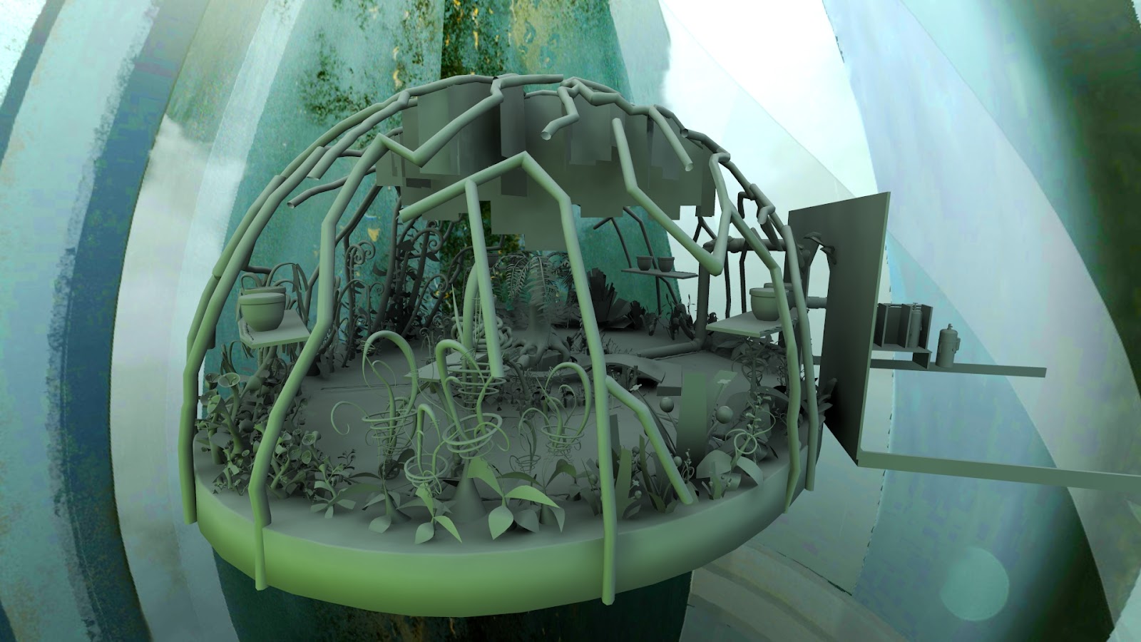
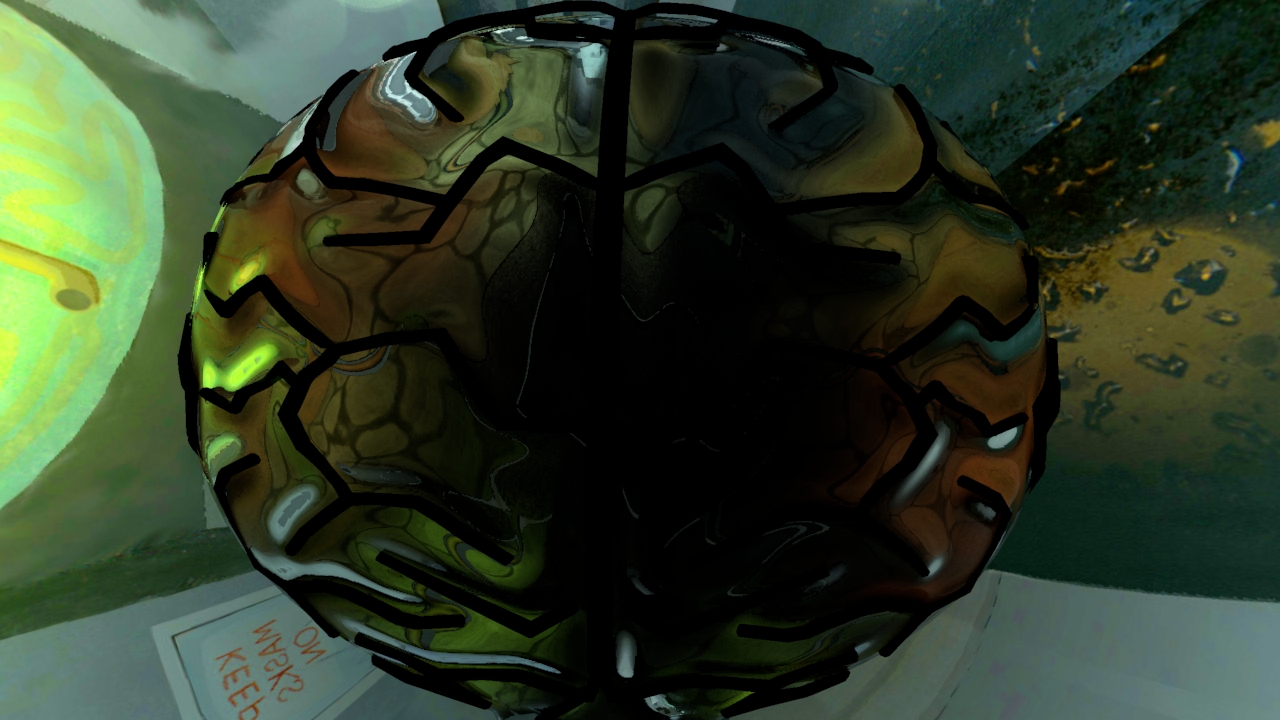
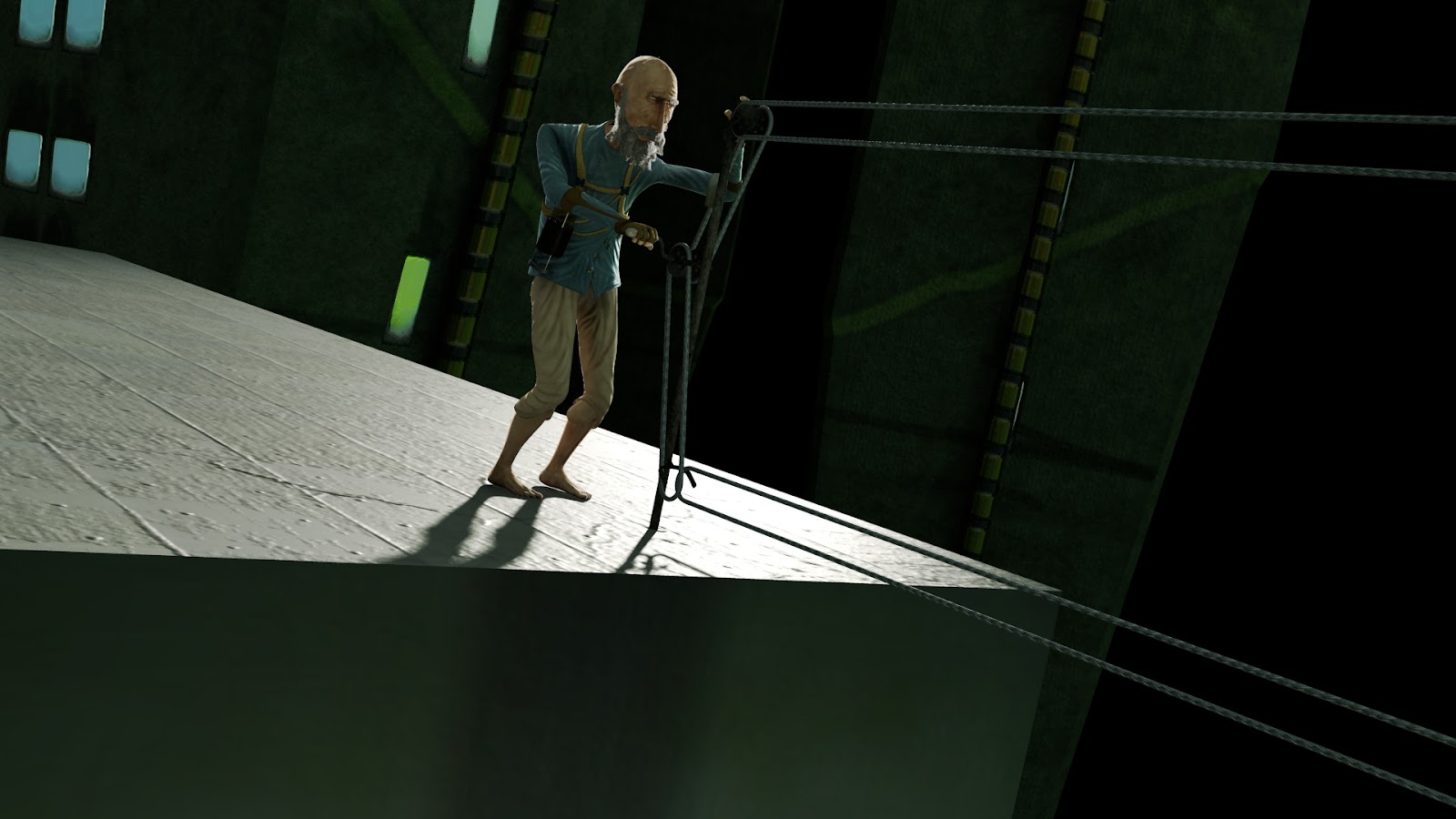
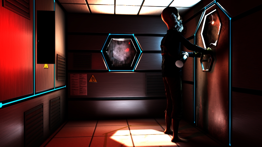
I've also been slowly making moves on the Kernel fixes. I think I'm going to add an opening title. Tasteless and unpopular as the idea seems, I'm effectively admitting defeat and creating some expectations for the audience so they're not completely in the dark about the story at the outset. Im also planning on adding two shots which will clarify a couple of the plot heavy props. But these need discussing with the relevant team members before I can start working on them.
Re-Comp

Pixel Propaganda

An excellent article was written by the consistently interesting Kirk Hamilton, on writing videogame dialogue, in particular the enemy barks the player hears.

Monday, 30 April 2012

Kernel Condensed

Lets try something new:

I'mwaytoobusytowriteablogpostsoinsteadImgoingtouploadallmytestrendersforyoutoenjoywithminimalprose

I'd somehow forgotten about my awesome lambert lighting workflow, its so fast, I love it!
Plus it looks so gorgeous its almost a shame that all that colour gets absorbed by the textures in the final render.


The beauty of final gather, in this sequence the use is minimal and its almost more of a glorified and accurate ambient light. But much slower. Though I have started playing with the min and max radius settings which control the area and therefore speed of the final gather. Above is before, below is after.
These renders are from ages ago. I couldn't figure out how to make this exterior shot look better and you know what always makes things better?...
...rim lights, they emphasise outline and form. and help Leonard stand out from the background, these are special rim lights that only effect Leonard and nothing else in the scene.

Even from a distance they work well. (Enlarge to see them working well).

After referencing in all the props and sets this scene still look worringly bare, so we got our trusty 2nd year Sebastian to jump on it and conjure up some details for the top of Leonard's skyscraper, with limited time he managed to generate some models, and faithful Ryan completed the task admirably with textures, prop placement and cleanup.
 Just when I thought I was done with the greenhouse...

Another sneaky trick in lighting is to create a light that only emits specular (shiny) light rather than diffuse (soft) light, and then attach it to only the eyes of a character. This allows you to create lots of tight highlights that bring out that glistening, alive look, in a character's eyes. As seen below (enlarge to see below).
I was being useless with my feedback for a particularly tricky shot to comp so I made this as a template for the city composites, to communicate the visual style I had in mind. It still amazes me what you can do to a plain render with compositing. God rays, lens smut, and lens flare save the day.
That post was not as succinct as I originally planned, but I think thats a good thing.

Pixel Propaganda

Richard Lemarchand, a great game designer whose words made into into my dissertation, recently left Naughty Dog after working on the Uncharted games. He's gone to teach, travel, and make experimental games. I want to go with him.

The guys at Digital Domain made a making of for real steel and the use of Vray renderer in it. Its really cool, some great breakdowns, and a lot of talk about the est features of Vray, makes me wish mental ray had them.


Creative director at Irrational Games, Ken Levine always has interesting things to say about writing for games, mostly because they way he writes for them work so well with the medium, despite coming from a cinematic background.

I still can't quite believe several things about this trailer. Firstly its running on proprietary technology, secondly that its realtime, thirdly that it was made by 2 people, and lastly that the game its promoting actually sounds legitimately interesting. Very very exciting.


Also legitimately exciting: when people who write interesting things about games fling down their pen and exasperation and go and make them themselves. Nels Anderson wrote a great blog and now he's a gameplay designer at Klei working on Mark of the Ninja. Which looks like an awesome, intensional stealth game, where all the games systemic elements are visually represented to maximise player understanding and agency.


Sunday, 22 April 2012

A Whole Lotta Len

Weekends are traps. You're powering along one second kicking keys and taking frames, then its friday evening and you go to bed. Now its Saturday morning, late morning, now its the afternoon, your heads so fuzzy you can't get out of bed. Its more like a weakend its so hard to do anything, I swear if you just looped back to Monday on Friday evening this would not be a problem. But I feel better now, and know Monday will be easier for it.

It was a big week with the presentation of the Edit In Progress that Charlie did a majestic job with. SO MUCH ANIMATION got done for it there's only a couple of blocks of scenes left to start, the rest is in hand or finished. We blew ourselves away, which was great for morale.

What I've been up to is scrambling to keep up with the rendering to be done as a consequence of this, its been great to have new environments to light as I am thoroughly sick of the greenhouse, its heavy, and slow, and gorgeous. But there are still some key shots left to do there as the dynamics are now ready for them.

These are two frames from shots Hugh has been working on.

I had a lot of fun lighting the airlock, its a small space with clearly defined sources of light in the two windows and HAL light. Its quick to render and gives a lot of control and definition to the lighting artist. I started by creating the base lights to work from and got some pleasing looks but were too hot looking, almost furnace like.

I experimented a lot with area lights for the windows as they fit the shape well and had a more realistic falloff in terms of shape. But they also had a tricky intensity different to the spotlights I used in the shed which made it had to get everything lit, hence the blow out furnace look. It wasn't until the second airlock shot I lit that I tried the CPU meltingly expensive area light with raytraced shadows. The area light with raytraced shadows is the most realistic lighting tool bar image based methods, and it is slow and stunning. I applied one to the outside of the door and it evenly lit Leonard's face, beard, and mask so realistically it made the old light look retarded. Its something mental ray is moving more and more towards as they refine and speed up their raytracing stuff.

Depthmap
While I love this shot, perhaps my favourite so far, the way the depth map area light illuminates the face, beard, and fur is very uneven and oddly exposed compared to the one below where, his beard in the correct shade of grey, looks soft and realistically lit, his skin shader is scattering correctly, and his mask has a nice rim lighting to it. Its hard to see the direct improvement when I don't have the render of how bad this second shot looked before, the mask was just a white blob.
Raytraced.

So now I'm on the last frontier of lighting. The exterior. I already have the city lights to work from but they are by far the weakest in my eyes and aren't much of a starting point. It also doesn't help that the top of Leonard's skyscraper is very barren looking, even the texture is low-res, so we've drafted in Sebastian again to pretty it up after the great stuff he did in the city.

Pixel Propaganda

Our own Tom wrote a good post about what he wants out of our final major projects. He even commends Jake on answering the call of the keyframes and stepping up to a task that he wasn't necessarily prepared for, like many of the Kernel team have had to.

And interesting announcement came from a studio formed by one of the writers at Rock Paper Shotgun about an open world game they are making about AI, autonomy, terrain generation, and not making the player the centre of the gameplay systems. Also it has an English aristocracy themed character aesthetic. Awesome.

Someone wrote a profile on Jonathan Blow, who I love, and there's a bit in the article where he's hanging out playing Littlebigplanet, which I love, with Tom Bissell, an author who I love. Never wanted to be somewhere so much in my life. Though on the whole the article takes a very negative stance on games in general which is a shame.

There's been some controversy due to the amount of bigotry towards EA due to the same sex relationships in their games. As a proud lesbian in Mass Effect 3 I think everyone should read Charlie Brooker's excellent response to these people, even Stephen Fry got involved. Says something about the cultural awareness games now have.

There's a lot of stuff I have to share thats piled up between posts, and this is an amazing interview from the creator of Journey.

Then there's some stuff on Peter Molyneux leaving Lionhead to make 'great' things. I love that attitude at this point in his career.


Tuesday, 10 April 2012

Painstaking Pixels

I don't know where to start.

When I'm writing these blogs I usually go through the images and renders I've saved over the week that I want to share and base the writing around them, I didn't used to do that, but they've become so long and sprawling and infrequent that its the only way I can remember.

So if you'll please turn to figure 1.0

Mosscott
Here we have an image of Moss Scott, the mascot for Kernel during studio time. He partly exists due to the number of times I asked Ryan to cover everything in moss, partly as a nest for the rivet we found in the studio (I think) that matches Leonard's rivet perfectly, and partly to keep spirits up with his jokes.

Figure 2.0
This is the look of the final knowledge cloud and its thanks to Kai's fluid fanciness that it looks this detailed, I borrowed a combination of his and the script's lights to light it like this. He's also placed a particle system in the center which orbits the central light like a nucleus. This was the first time I'd properly used lights with a negative intensity before. Its great because you can actually subtract light from the surroundings and its what gives the cloud that deep red underside.

Figure 3.0
This is the shot that the mask was made for, to properly reveal Leonard, but that strap has been a complete bastard to simulate. Not only did it take forever to fix as it intersected with his head and face over and over again, when it came to render time Maya just ignored the cache and re-simulated it, managing to get the strap right through his nose and mouth for the last 50 or so frames. Why?
I love the red and blue colour palette of this shot's lighting. What was useful about this shot was it forced me to make some final tweaks to the fur and eye shaders so they held up to close scrutiny a little better.
Figure 3.1
Not what he signed up for.

Figure 4.0
I've taken to lighting Leonard alone at first in some scenes now as they are so heavy with geometry and dynamics that it takes half the render time just 'translating the frame' which essentially is it copying everything to the RAM I think, so it can render. This way it copies relatively little and I can start seeing what changes I need to make without have to wait 5 minutes.

Figure 4.1
I got carried away and starting compositing this one. Delicious. You can just see the beginning of Liam's lights and the animated shader I worked on with him. It should look spectacular in motion.

Figure 5.0
As Len's darkest moment where he realises his oxygen is broken, I figured it was time to take that darkness quite literally. And also time to break out the lens flare, but not too much, keep it classy.
Whats weird is this was rendered with final gather, which seems to have covered up the sub surface effect I was getting through his ear. I believe this is because the diffuse light is stronger than the scattered light, but I don't understand why there are such dark bits in his ear. I may have to fake the final gather to get that back, I'd turned it right down anyway so its only go to speed up render time.

We have around 5 weeks left. Its going to be interesting. I am still optimisitic.

Pixel Propaganda

I'm proud to say I understand 90% of what they're talking about in the new release of mental ray's update notes.

An article I'd been meaning to read for weeks turned out to be pretty interesting. Its on one of Pixar's cinematographers. She talks about how her painting allowed her make some observations that helped improve the atmospherics lighting in one of their films.

A good interview with the father of the Metal Gear games. he talks about why and how he innovates and some of his feelings about his own creative successes and failures.


Saturday, 31 March 2012

We Built This City...

The Greenhouse, From The Outside
Final lighting for the greenhouse is complete  as seen above from both the exterior, and below from the interior:


This is one of those old blog posts, it sits in the drafts section getting a bit stale, its still tastes good but the texture isn't as fresh as it once was and you're not quite sure which tense to write it in now, two weeks since the last post.

Team Kernel made a city. It doesn't have a name but its in keeping with the Kernel visual style, conveys the oppressive and ubiquitous theme of ignorance, and the majority of it was in fact modelled and textured by our faithful second year Sebastian. Since he completed it I've been going through tweaking the textures very slightly, creating reflection maps for the windows, and applying shaders to it before I could light it.
Shiny Window Shaders
I started with the same workflow as the greenhouse with a final gather sphere, and this time a directional light. The colours from the sphere were overly green though, while I like the effect, its not contrasting enough to the greenhouse. Also its hard to tell anything for sure without the atmospherics and smog in the scene.
The Greenhouse Effect
I tweaked the final gather incandescence map  to create a more neutral colour palette but lost too much of the character of the environment so opted to create a more controlled incandescence map. I wanted to create a bright spot in the center for the sun and have that tail of into the darker edges of the city. What I ended up with is this bluer, smudgier, more focused lighting map:
Final Gather Incandescence Map
The city is really simply lit scene, by far the quickest I've made, but still pretty slow to render once I added the smog Alan made which has raytraced shadows through it. There are just some really simple point lights filling out the hollow buildings and a spot and point light combination illuminating the frame buildings to highlight the architecture.
...On Rock & Roll
I'd neutralised the colours of the final gather and sunlight at this point, but it just lost all sense of atmosphere. Getting the sunlight onto the smog was tricky because I had a mental ray physical sun shader on the directional light to create quicker soft shadows on the buildings, which worked great, but this meant that it would work with the fluid. So I separated out the smog onto a separate render layer and created a layer over-ride that made the directional light ignore the physical sun shader and just do a simple raytrace shadow. But this didn't create the correct shadows until I'd made a duplicate city, that was invisible, but still casted shadows. After this elaborate work around it turned out fine.
Billboards have they're own dedicated spot lights.
The Smog of Ignorance
Now that all the assets have been generated for Kernel, all the sets, props, dynamics most people have moved onto animation. This means that instead of our one man animation army we have at least 7 animators at the moment, progress as absolutely blitzing and I can barely keep up with lighting each shot, its fantastic! We have every shot accounted for by an animator for two thirds of the film. It just go to show that there comes a tipping point in every project where all the manufacturing of pretty things is completed, allowing the actual film making to start, the performance, lighting, and rendering of each shot. Morale seems to be up, productivity seems to be up, at this rate we're going to finish with something not only pretty, but quite substantial. Have a render, click to enlarge:
Leonard Enters The Greenhouse
Apparently I wrote a dissertation in my down time, no big deal. I even made a front cover for it which just reminds me of when I went to a Steiner school and there was a lot of emphasis in taking pride in your work and the presentation of it. I wanted to illustrate the main argument pictorially so I made a triangle of game mechanics (cogs), ideas (lightbulb), and the thoughts and feelings they generate (brain/heart). It would be awesome to get this published somewhere but I'm not sure how to go about doing that. Maybe I'll post it on the blog in chapters, or smaller installments, but I don't know that anyone would actually read it.
The Process of Meaning

Pixel Propaganda

Frictional games, creators of the excellent Amnesia: Dark Descent, often have interesting things to say about game design. Thomas Grip here talks about their approach to game design and how its unconventional, it seems like its most definitely the best direction games could be going in.

He crops again in this interesting gamasutra article on storytelling in games which also features the writers of Portal 2.

I love Braid, I love Jonathan Blow, and everyone should always listen to everything he says because hes always right. While that may not be true, its the feeling I get when I hear him speak, all his design philosophies come from the right places.

Autodesk released a bunch of talks on their youtube channel and this one was actually given by a student and some of the points he made were particularly familiar to our work on Kernel. Especially the emphasis on each team member filling multiple roles over the course of production.


There was another talk on the lighting in Killzone 3 and a part about the use of volume lights, something I'm not used to using which seemed to work really well and was very interesting.

Quantic Dream, the studio behind my favourite game of 2010 Heavy Rain recently released a short film which doubles as a tech demo for their new game engine. I'm excited for whatever they do next from a design perspective, but graphically, having moved to PC, this looks dated in comparison.


P.S. Happy 30,000 views to The Pixel Crush.


Saturday, 17 March 2012

Verte Vertices

I've been having real trouble with the render times in the green house which has meant turning down the subdivision levels on the smaller plants where its unnoticeable, deleting backfaces on the moss, and then performing reduce functions on the whole lot as a combined mesh. Messy but really effective as the scene now runs a lot smoother in the viewport.

Now lets rewind in time as I have another shot that I haven't talked about.
Seeing as the elements in this scene are quite close proximity to each other in terms of depth I wanted to pick out the outlines of Leonard with a rim light and make the pillar in the foreground a little darker to pull attention away from it.
Bounce lighting was harder to fake in this shot as the point where the sun hits the floor is in view and therefore placing spotlights looked wrong as their cone is clearly visible as seen in the above render. Something I saw in a killzone cinematics breakdown video recently was the use of volume lights to amazing effect for broader strokes of colour or light, perfect for cheating this kind of thing, so I plan to play with those at some point soon.
I accidentally deleted the shaders for the oxygen tank and the pipe isnt in shot here so it needs a re-render anyway but this is pretty close to the final lighting for this shot.

First thing that needed doing was to finally lay out the wonderful plants Ryan and Nigel had modelled into their positions on the flowerbeds of the greenhouse.


It was time to start the greenhouse lighting as the final props and set stuff for that was just falling into place and so I decided because it was an exterior scene it was important for me to be able to use proper final gather to get that realistic outside look. I started by creating a giant sphere to encompass the entire greenhouse and plugged Charlie's concept art from the beginning of the project into the incandescence value of the sphere's shader. This means that with final gather enabled it looks at the colour information of the sphere's incandescence and proceeds to light the scene accordingly which is a fantastic starting point, especcially as it was concept art of the city, so it should fit nicely in the final composite. I made a cube with some holes to let light in to test the set up:
Then I added a spotlight for the sun to see how much lightness it added, what angle might be good, and how far I needed to position the light away to get interesting shadows.
I then imported the scene and applied a lambert to the whole thing and got this fantastic result, isn't it gorgeous!? This is from nothing but indirect final gather lighting from the sphere.
With textures the result is still nice but you don't get the same effect of soft light and colour. So from I here I tweaked a lot of shaders and Jake helped by desaturating and re-colouring some of the textures to better match the pastel tones of the original designs that Charlie had made. Great as the plants look some of them had never had textures made for them so I had to bodge it by assigning different coloured shaders to different bits of geometry and using procedural maya textures for bump maps, not ideal, but not the end of the world.
With the sunlight turned back on this is the result, and while the hard sun light doesn't match the dingy weather outside with a few tweaks I felt I could be on the right track.
First I needed to fix something that'd been a problem for a while and texture it properly which was the glass and pipes of the greenhouse itself. Glitchy reflections had been bugging this shader forever and I thought I had fixed it with a weird combination of backface culling and solid refractions in the mia_material. I was wrong, it turns out after lots of fiddling and rendering it was the glass trying to refract itself, which is easily fixed but telling it not to show up in reflections.
Then I textured some mossy algae stuff around where the pipes intersected the glass and some dirt and scratches from flying debris that had tarnished the glass between pipes from the outside. Getting the alpha channel for this texture to work properly took forever. Apparently the cutout opacity thing I found before doesn't work because that literally cuts out the shader, not just the texture on its surface so I lost the refractions as well as the texture: no good.

After some deep thought I realised the using the transparency channel wanted the opposite information of what an alpha matter wanted and that was the reason it wasn't working, the mia material wants white where it shouldn't be transparent and black where it should be opaque. I can't remember how I figured that out but there was logic in the somewhere. Anyway it worked:
Also another problematic shader: The moss hanging from the pipes. Apparently called Spanish Moss. This one looked gorgeous with the mia_material and the translucency properties set correctly with a small amount of transparency but as soon as it tried showing things that first been refracted (the entire greenhouse) through its alpha outline it started glitching out with coloured and ugly pixely silhouettes.

I couldn't find a fix for this after ages and so resorted to a lambert and achieved a similar effect but it seemed incredibly slow to render so hopefully that won't come back and screw me over. At least it fixed the awful glitchy refracted alpha situation. 
Here is a breakdown of the greenhouse lighting as it now stands with the coloured lights for each bed of flowers to aid the sense of a colour gradient from one type to another (above).
Then the lamp lights which I think I have now localised so they look more like bright spots in the greenhouse rather than just a general yellow glow.
Then the dull light of the sun. Not sure what to do about this, I think I might try and frame the tree as if the sun is shining in a shaft between two towering buildings and just illuminating a strip of the greenhouse with its light.

Have some renders. So far too bright, too cluttered and before the optimisations this took 19 minutes. I like the colours though. Click to enlarge.
This one has a glitch on the hanging moss where I forgot to tell the greenhouse glass to transmit transparency so its not showing whats on the other side of it to the moss I think. Its either that or transmit refraction. This is a nice render with the sun on the tree and I think depth of field will do wonders for breaking up the overwhelming detail of the scene. Its still missing something though, in terms of lighting. This render took about 40 minutes originally, but its now below 10 which is my render threshold. Amazing what a little optimisation can do.

Pixel Propaganda

A great looking short called ruin. I mean really great looking. Unofrtunately its story is pretty non-existant and what is there is ripped straight from genericness, but its gorgeous and short so...
http://www.conceptruin.com/

This is a trailer for a game where al the props are handmade in reality, the first stop motion platformer?