Final lighting for the greenhouse is complete as seen above from both the exterior, and below from the interior:
This is one of those old blog posts, it sits in the drafts section getting a bit stale, its still tastes good but the texture isn't as fresh as it once was and you're not quite sure which tense to write it in now, two weeks since the last post.
Team Kernel made a city. It doesn't have a name but its in keeping with the Kernel visual style, conveys the oppressive and ubiquitous theme of ignorance, and the majority of it was in fact modelled and textured by our faithful second year Sebastian. Since he completed it I've been going through tweaking the textures very slightly, creating reflection maps for the windows, and applying shaders to it before I could light it.
Shiny Window Shaders
I started with the same workflow as the greenhouse with a final gather sphere, and this time a directional light. The colours from the sphere were overly green though, while I like the effect, its not contrasting enough to the greenhouse. Also its hard to tell anything for sure without the atmospherics and smog in the scene.
The Greenhouse Effect
I tweaked the final gather incandescence map to create a more neutral colour palette but lost too much of the character of the environment so opted to create a more controlled incandescence map. I wanted to create a bright spot in the center for the sun and have that tail of into the darker edges of the city. What I ended up with is this bluer, smudgier, more focused lighting map:
Final Gather Incandescence Map
The city is really simply lit scene, by far the quickest I've made, but still pretty slow to render once I added the smog Alan made which has raytraced shadows through it. There are just some really simple point lights filling out the hollow buildings and a spot and point light combination illuminating the frame buildings to highlight the architecture.
...On Rock & Roll
I'd neutralised the colours of the final gather and sunlight at this point, but it just lost all sense of atmosphere. Getting the sunlight onto the smog was tricky because I had a mental ray physical sun shader on the directional light to create quicker soft shadows on the buildings, which worked great, but this meant that it would work with the fluid. So I separated out the smog onto a separate render layer and created a layer over-ride that made the directional light ignore the physical sun shader and just do a simple raytrace shadow. But this didn't create the correct shadows until I'd made a duplicate city, that was invisible, but still casted shadows. After this elaborate work around it turned out fine.
Billboards have they're own dedicated spot lights.
The Smog of Ignorance
Now that all the assets have been generated for Kernel, all the sets, props, dynamics most people have moved onto animation. This means that instead of our one man animation army we have at least 7 animators at the moment, progress as absolutely blitzing and I can barely keep up with lighting each shot, its fantastic! We have every shot accounted for by an animator for two thirds of the film. It just go to show that there comes a tipping point in every project where all the manufacturing of pretty things is completed, allowing the actual film making to start, the performance, lighting, and rendering of each shot. Morale seems to be up, productivity seems to be up, at this rate we're going to finish with something not only pretty, but quite substantial. Have a render, click to enlarge:
Leonard Enters The Greenhouse
Apparently I wrote a dissertation in my down time, no big deal. I even made a front cover for it which just reminds me of when I went to a Steiner school and there was a lot of emphasis in taking pride in your work and the presentation of it. I wanted to illustrate the main argument pictorially so I made a triangle of game mechanics (cogs), ideas (lightbulb), and the thoughts and feelings they generate (brain/heart). It would be awesome to get this published somewhere but I'm not sure how to go about doing that. Maybe I'll post it on the blog in chapters, or smaller installments, but I don't know that anyone would actually read it.
The Process of Meaning
Pixel Propaganda
Frictional games, creators of the excellent Amnesia: Dark Descent, often have interesting things to say about game design. Thomas Grip here talks about their approach to game design and how its unconventional, it seems like its most definitely the best direction games could be going in.
He crops again in this interesting gamasutra article on storytelling in games which also features the writers of Portal 2.
I love Braid, I love Jonathan Blow, and everyone should always listen to everything he says because hes always right. While that may not be true, its the feeling I get when I hear him speak, all his design philosophies come from the right places.
Autodesk released a bunch of talks on their youtube channel and this one was actually given by a student and some of the points he made were particularly familiar to our work on Kernel. Especially the emphasis on each team member filling multiple roles over the course of production.
There was another talk on the lighting in Killzone 3 and a part about the use of volume lights, something I'm not used to using which seemed to work really well and was very interesting.
Quantic Dream, the studio behind my favourite game of 2010 Heavy Rain recently released a short film which doubles as a tech demo for their new game engine. I'm excited for whatever they do next from a design perspective, but graphically, having moved to PC, this looks dated in comparison.
I awake in the molten sands of a desert. Rising, grains of it fall from my scarlet robe, I know I am on a journey, the title has told me that much, and it is all I need to know. As the sand moves under my feet I set off on my pilgrimage, into the unknown of the undulating dunes.
Journey is the latest game from ThatGameCompany who brought the world such varied experiences as Flow and Flower. If you ever plan to play this game then please stop reading, refrain from seeing or hearing any more on it, as the more that surprises you about this game the stronger the experience is.
Whats new about Journey is not the methods by which it leads the player along its path but the way it evokes feelings whilst doing so, one reviewer commented on the elements inspired by other games, and there is evidence of drawing from other game's strengths. The iconic landscapes of Shadow of the Colossus strewn with crumbling viaducts and bridges features in one section, while the constant goal of the lit peak on the horizon is quite reminiscent of the ever present singularity tower in Half Life 2: Ep.2, always reminding the player of the importance of certain narrative points.
Jenova Chen, co-founder of TheGameCompany, is often reluctant to talk on the artistic intent of his games, but in an interview he did reveal one of the themes for Journey whilst designing its gameplay mechanics. When walking down a street in a crowded city people rarely greet each other, the interaction between people is not cherished as it would be on a moutain hike where to see another person is a rare occurance. Maybe you walk with them and talk a while before separating ways again. This is the experience, and the emotions of companionship and shared memory that go with it, that they strove to create.
In the online gaming community of sports, shooters, and MMOs: identity is paramount. You must connect to your avatar because then you will invest time into developing your character's skills and appearance in order to differentiate yourself from you team mates or competitors. This culture of individualism would have destroyed the experience Journey aims for as it is very important you don't have this separation of identity when you meet a companion. For your companions are in fact other pilgrims, on other consoles, travelling with you through bandwidth, and sand.
Journey creates commonalities between players to help foster that kinship of two travelers. Mechanically you have a common destination, the very act of walking beside someone, whether you're leading or following creates literally a shared direction. Visually you have a common appearance, you are clearly here for same reason. Your red robe and dark face mean that you have no reason to discriminate or even differentiate between yourself and your companion, you belong together. Aurally you speak the same language, an alphabet of woodwind words, flute-like in timbre. This simple method of speech allows primitive expression that can connote fear or excitement with some rapid toots, a call or farewell with a louder sustained note, but none of this is taught to the player or written in a manual it merely exists as a system of expression between players to further unify them.
Yet for all this common ground between players it is still essential that players are strangers to begin with. As strangers the evolution of your acquaintance with each other parallels the evolution of the journey you take together, you discover a new place whilst simultaneously discovering a new person. Another of the game's metaphorical systems of play is the attainment of scraps of cloth to add to your scarf. Mechanically this allows the player to spend longer in the air as they expend the magic symbols inscribed along the length of their scarf. It also gives the player a sense of history, like each scrap is a memory collected and stored, and who has the most memories? The well traveled, the experienced: the elderly.
When I met a companion with a scarf significantly shorter than my own, I had subconsciously understood the game's systemic analogy for age and automatically felt a sense of responsibility that I couldn't place without the hindsight I now have. My relationship to this companion took on the role of teacher and disciple, the veteran pilgrim leading a traveler on their transition into adulthood, though I had never completed the journey myself, I took the lead followed by my companion, when I waited so did my companion. I developed a connection to the point where I gasped when my companion was attacked by a leviathan of a creature that resided in the cave we were passing through, I feared my disciple was gone, permanently. I felt responsible. I had not been the protection I should have been. This consistent 'tight coupling' of mechanics and themes is something that I spent 9,000 words advocating in my dissertation, so to see it in a game the day before hand in was just a complete joy.
There are other anecdotes of abandonment, euphoria, and relief at not being alone at the end. And this is only one person's experiences with a game that offers such an emotional range I imagine there are thousands of emergent stories being told by players, all variants on the template which ThatGameCompany created. Journey is just one of those very rare games that manifests its vision so completely, so elegantly.
"This move (to abstraction) underscores ThatGameCompany's sophistication: in a medium where interpretation is scorned as indulgent and pretentious, Journey gives no ground: the player must bring something to the table." (Bogost, 2012).
After its all over you are presented with a screen of PSN ID's, the online identities that you spent your journey with. So if you did value your time with you fellow traveler, maybe you actually did find a like minded person who you now have the opportunity to contact, now you have the opportunity to extend that relationship beyond the boundaries of Journey. But the screen fades before too long and I got into the digital equivalent of that situation where you lost the contact details of someone you met on holiday, so if my companion debellatoro1 (or similar, because that PSN ID didn't work) ever reads this, send Olninyo a message.
I'm glad I was not alone, on my journey to the end.
I've been having real trouble with the render times in the green house which has meant turning down the subdivision levels on the smaller plants where its unnoticeable, deleting backfaces on the moss, and then performing reduce functions on the whole lot as a combined mesh. Messy but really effective as the scene now runs a lot smoother in the viewport.
Now lets rewind in time as I have another shot that I haven't talked about.
Seeing as the elements in this scene are quite close proximity to each other in terms of depth I wanted to pick out the outlines of Leonard with a rim light and make the pillar in the foreground a little darker to pull attention away from it.
Bounce lighting was harder to fake in this shot as the point where the sun hits the floor is in view and therefore placing spotlights looked wrong as their cone is clearly visible as seen in the above render. Something I saw in a killzone cinematics breakdown video recently was the use of volume lights to amazing effect for broader strokes of colour or light, perfect for cheating this kind of thing, so I plan to play with those at some point soon.
I accidentally deleted the shaders for the oxygen tank and the pipe isnt in shot here so it needs a re-render anyway but this is pretty close to the final lighting for this shot.
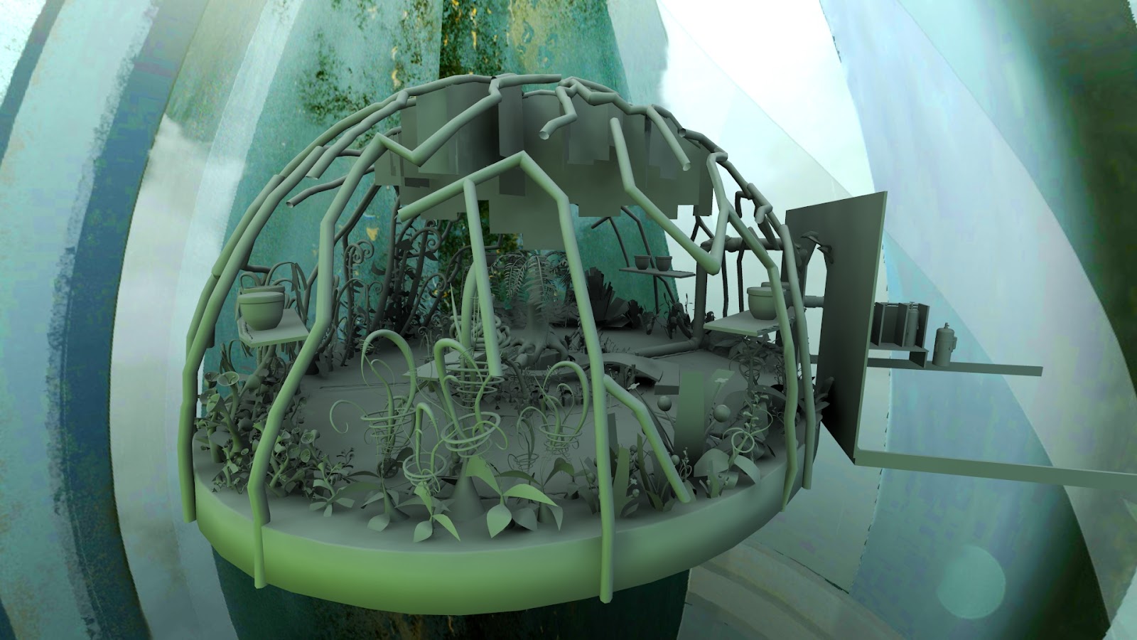
First thing that needed doing was to finally lay out the wonderful plants Ryan and Nigel had modelled into their positions on the flowerbeds of the greenhouse.
It was time to start the greenhouse lighting as the final props and set stuff for that was just falling into place and so I decided because it was an exterior scene it was important for me to be able to use proper final gather to get that realistic outside look. I started by creating a giant sphere to encompass the entire greenhouse and plugged Charlie's concept art from the beginning of the project into the incandescence value of the sphere's shader. This means that with final gather enabled it looks at the colour information of the sphere's incandescence and proceeds to light the scene accordingly which is a fantastic starting point, especcially as it was concept art of the city, so it should fit nicely in the final composite. I made a cube with some holes to let light in to test the set up:
Then I added a spotlight for the sun to see how much lightness it added, what angle might be good, and how far I needed to position the light away to get interesting shadows.
I then imported the scene and applied a lambert to the whole thing and got this fantastic result, isn't it gorgeous!? This is from nothing but indirect final gather lighting from the sphere.
With textures the result is still nice but you don't get the same effect of soft light and colour. So from I here I tweaked a lot of shaders and Jake helped by desaturating and re-colouring some of the textures to better match the pastel tones of the original designs that Charlie had made. Great as the plants look some of them had never had textures made for them so I had to bodge it by assigning different coloured shaders to different bits of geometry and using procedural maya textures for bump maps, not ideal, but not the end of the world.
With the sunlight turned back on this is the result, and while the hard sun light doesn't match the dingy weather outside with a few tweaks I felt I could be on the right track.
First I needed to fix something that'd been a problem for a while and texture it properly which was the glass and pipes of the greenhouse itself. Glitchy reflections had been bugging this shader forever and I thought I had fixed it with a weird combination of backface culling and solid refractions in the mia_material. I was wrong, it turns out after lots of fiddling and rendering it was the glass trying to refract itself, which is easily fixed but telling it not to show up in reflections.
Then I textured some mossy algae stuff around where the pipes intersected the glass and some dirt and scratches from flying debris that had tarnished the glass between pipes from the outside. Getting the alpha channel for this texture to work properly took forever. Apparently the cutout opacity thing I found before doesn't work because that literally cuts out the shader, not just the texture on its surface so I lost the refractions as well as the texture: no good.
After some deep thought I realised the using the transparency channel wanted the opposite information of what an alpha matter wanted and that was the reason it wasn't working, the mia material wants white where it shouldn't be transparent and black where it should be opaque. I can't remember how I figured that out but there was logic in the somewhere. Anyway it worked:
Also another problematic shader: The moss hanging from the pipes. Apparently called Spanish Moss. This one looked gorgeous with the mia_material and the translucency properties set correctly with a small amount of transparency but as soon as it tried showing things that first been refracted (the entire greenhouse) through its alpha outline it started glitching out with coloured and ugly pixely silhouettes.
I couldn't find a fix for this after ages and so resorted to a lambert and achieved a similar effect but it seemed incredibly slow to render so hopefully that won't come back and screw me over. At least it fixed the awful glitchy refracted alpha situation.
Here is a breakdown of the greenhouse lighting as it now stands with the coloured lights for each bed of flowers to aid the sense of a colour gradient from one type to another (above).
Then the lamp lights which I think I have now localised so they look more like bright spots in the greenhouse rather than just a general yellow glow.
Then the dull light of the sun. Not sure what to do about this, I think I
might try and frame the tree as if the sun is shining in a shaft
between two towering buildings and just illuminating a strip of the
greenhouse with its light.
Have some renders. So far too bright, too cluttered and before the optimisations this took 19 minutes. I like the colours though. Click to enlarge.
This one has a glitch on the hanging moss where I forgot to tell the greenhouse glass to transmit transparency so its not showing whats on the other side of it to the moss I think. Its either that or transmit refraction. This is a nice render with the sun on the tree and I think depth of field will do wonders for breaking up the overwhelming detail of the scene. Its still missing something though, in terms of lighting. This render took about 40 minutes originally, but its now below 10 which is my render threshold. Amazing what a little optimisation can do.
Pixel Propaganda
A great looking short called ruin. I mean really great looking. Unofrtunately its story is pretty non-existant and what is there is ripped straight from genericness, but its gorgeous and short so... http://www.conceptruin.com/
This is a trailer for a game where al the props are handmade in reality, the first stop motion platformer?
I didn't manage an update last weekend so here's one a little later. Team Kernel are now working in the studio every weekday, almost everyone putting in their 9 til 5's, and its great to see people working harder than ever. Because my time is so scattered between people in the studio I find it very hard to remember what specific things I have personally accomplished each week as its so mixed up with providing feedback for and tweaking other's work. I have spent a lot of time finalising shaders for props in the shed, and more recently both the tree and the glass in the greenhouse.
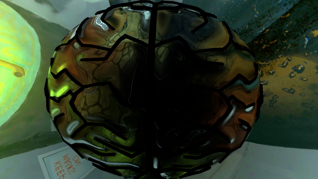
Brain Greenhouse Exterior
Its taken quite a while getting the greenhouse looking how I wanted (vaguely) and a number of different cheats and techniques. In order the create a much more interesting refraction of things through the glass and better specular highlight I want to create the effect that the glass was bulging up between the pipes, almost like the hexagonal bubbles that make up the biomes at the Eden Project. To save this being modeled in an intensely awkward and slow manner, I opted to bring the pipes and glass into Mudbox and use its ambient occlusion map extraction to create a bump map for the glass. By using the pipes to create dark occlusion on the glass mesh I could create a bump map that dipped in around the pipes and bulged out in the space between. It wasn't a perfect solution and there are still some weird aliasing problems on the specular when the bump is turned up to 1, but its very cunning and creates a decent effect.
Brain Greenhouse Interior
I also had some weird problems where the pipes where glitchily reflecting inside the glass in these ugly triangle shapes, after a lot of fiddling I managed to get rid of it by extruding the glass so it physically had depth, then telling it to be solid glass, but with backface culling. This is basically the same as telling the shader the geometry only has front faces (like when it started) but for some reason it no longer generated ugly refractions: magic! If you're wondering what the photographic background is I was using to test the refractions its the Team Kernel photo we took last week to put in a frame on Leonard's desk as a little secret to hide in the film. Everyone present that day got a place in the photo and texture king Nigel nimbly photoshopped it together with Big Len.
Team Kernel
The other shader thats been giving me hell was the tree which I've been trying to plug both bump and normal maps into, as per the wonderful (but unpredictable) mia_material shader allows.
Finally after lots of trial and error I have it working and translucent, alive looking leaves too. All I originally planned on doing was giving the leaves slightly different hues like I did with the books in the shed but ended up going a lot more in depth and not getting that done at all. Maybe tomorrow?
Cathexis Tree
My lighting workflow has really started to solidify. I create a lambert override so there are no textures, just the colours of the lights. Then I start with the ambient lighting in the room: coming from windows or the sky.
Ambiant
Then a key light or sun light that is the most obvious and prominent light, hopefully with some striking shadows. This usually needs some bounce lights which in this example is the underneath of the wooden oxygen case.
Key Light
The scene was looking very dark at this point so I created more ambiant light and added the flashing light on the oxygen tank itself.
Prop Light
After rendering and a quick comp with bokeh depth of field, some horizontal glow and lens smut, it turned out like this:
Comped
Charlie has done a fancy version with motion blur but that still needs some dynamics added to it in the form of oxygen escaping from the broken rivet that pops out of the pipe after the tank hits it.
Shed Lights 2.0
As a result of that shot I had updated a lot of the existing shed lights which I use as a base to start from in each shot in the shed. Here's what its looking like at the moment. Almost all the textures are done too which is wonderful.
This last couple of days have been really tough. I keep swinging between moments of 'I'll finish this if it kills me' and 'why would anyone willingly make this their career?'. Right now, as long as I imagine how good it'll feel to finish this, I'm leaning towards the death by animation option.
Pixel Propaganda
Limbo was awesome, therefore by default so is this interesting article with its creators about running a tiny company and retaining creative integrity.
I recently found that ILM have their own youtube channel and among some of the amazing things on there was this video breaking down some of the shots in Rango, amazing seeing what they get away with, it makes stuff seem possible.
Then there was this Transformers one which is just an amazing insight into the effects, terrible film aside.
Someone was writing on the appeal of Far Cry 2 and why its sequel looks to ruin the great leaps it made for games. I can't help but agree and wince every time I see for of Far Cry 3.
Jesper Juul, a brilliant game theorist, did a talk on games as a medium for tragedy, something believed to be impossible, and made a good argument in opposition to that belief.
On a similar topic theorist Janet Murray, author of one of my favourite game theory books Hamlet on the Holodeck just wrote her first book since then. Here's an interview that shows just how fundamental her thinking is to the development of the 'digital medium'.
A cool plugin for maya which opens up all the best bits of the mental ray renderer that are hidden away. My trial expires in 23 days unfortunately, hopefully I'll get to try it out properly first.