 |
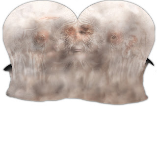
| Body_Diffuse |

Its always disturbing seeing a skin texture in its stretched and unwrapped form but here is Noel's. My work-flow started in Mudbox where I painted the texture quite roughly using photos I'd taken as stencils, this looked ok in the viewport but when I exported it to Photoshop it was a blotchy mess of collaged skin, so I took the Mudbox texture as a guide for where everything was laid out across the mesh and then re-painted it using the clone stamp tool in Photoshop, using each of the skin photos as a palette. This was a problem at first because of varying white balances and exposures in the photos so I did my best to balance them first so my texture looked cohesive.
 Here's how it looked in Mudbox. I tweaked it several times to try and avoid the burnt bacon look I seemed to be achieving I also used the displacement maps to add some of the wrinkle detail into the textures themselves which always help avoid that flat look you can get in a render with lots of ambient light.
I loved adding the details like the straggly hairs on Noel's otherwise bald scalp, its how I hide my woeful understanding of proportion- by layering little details that complete the character.
 |
| Note the detail picked up in the displacement by the specular highlight along the top of Noel's head |
 |
| What's that gelatinous protrusion from underneath your beard Noel? Maya fur f*ck up again? |
I actually managed to attach the separate displacement nodes to individual surface shaders that all fed back into an ambient occlusion shader and achieved the following- and as ever the the model's tiniest details are revealed in glorious monochrome. I'd like to do another turn around (that's right there's a turn around coming) with an ambient occlusion render and a mental ray contour pass for the actual wireframe mesh. It'll have to wait or now. I set a shader override for the fur so it was grey at the base and white at the tip, so I'm pretty sure it's not part of the AO but just fits due to the natural gradient of grey to white as it hangs farther from its point of origin on the skin.
 |
| Shiny bounce lighting. |
The arm is actually a reeeeeeally overly simple base mesh with fingers (badly) sculpted on top, but the illusion of a clenched fist would've required rigging otherwise so this was the most viable compromise I could think of, and the final look is quite nice with textures. When it comes to making a fully functional rig this will have to re-done.
I spent a little while tweaking the shader for the 'glove' and 'sock' parts of his overall but never quite achieved the look I had originally designed so that's something I'll need to re-think going forward. This near to final render wasn't what I was going for at all but by changing the colour of the refraction, reflection and diffuse to different hues created this semi-iridescent effect making it shimmer like some kind of jewellery.
 |
| Noel & his overly shiny sock/glove |
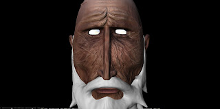
I've recounted this epic tale more times than is socially acceptable but it was rather stressful and frustrating. It took Nelson (my PC), my laptop, and 6 studio computers to render out half of Noel's turn around. When you've got light bouncing from object to object, and its being taken into consideration of the light scattering through the skin, rendering can get a little complex. Oh, and there are thousands of hairs hanging off his face all bouncing light around too. Shiny, I know. So after having it rendering at home overnight I worked out it wasn't nearly enough and made my way into uni for 10am to set the studio PC's going too. At 3:30pm I took what I had and caught the bus home after waiting at the bus stop for 30 minutes, I ran and everything! I then put it all together and handed it in with 2 minutes to spare, not a complete turn around but more or less, and I was pleased with it. So here is the final thing with missing frames added:
I'll save the other projects for another post. This one's too long already.
Pixel Propaganda
One thing I didn't get quite right was Noel's eyes, too much sparkly bump mapping and incorrect cornea shapes. Georg linked me this handy illustration of correct eye anatomy and how to go about recreating it, tear ducts and all.
When E3 was full of gratuitous amounts of everything I think it was fitting that most interesting thing I saw all show was this simple interview with Irrational Games' creative director Ken Levine. He talks about relationships, specifically within- but not limited to, Bioshock Infinite.

No comments:
Post a Comment
Let The Discussion Begin: