 |
| UVs! |
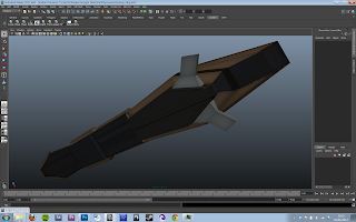 A friend of mine, Mr Luke Campion, contacted me recently and asked if I was interested in doing some texturing for a short film/vfx project he was getting started on. The models looked great and it had a narrative that builds well, so I agreed gladly. Above is the checkerboard I ended up with after unrwrapping in RoadKill.
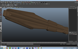 Trying to be efficient with texture seems and pixel real estate on the UV layout has a become a weirdly satisfying ritual with which any texture artist should take pride, making sure their texture is used efficiently and creates the most detail at the least cost. For example for this texture the engines and symmetrical wings are laid out identically so they share the same texture space, therefore allowing to both texture faster, and use less pixels on identical objects.
I remember reading on master zap's blog about using a fresnal reflections (the kind you see on water or glass) on metal, combined with turning the refractive index way up past accurate refractions to values of "25 or 50". This is weird because refraction is the bending of light through a transparent object, i.e NOT metal. But hey, some physics happens, and you get this result:
 |
| Ingot Ship |
I takes on a very golden appearance, a very naturalistic metal. Useful, just not the look I was going for. One of the points of reference I was given was District 9 which brings to my mind pastelly colours, matte finishes, and angular design. To get that plated look I made extensive use of the UV snapshot itself, using the lines of the wireframe to outline plates on the ship, both in the diffuse (filling them with paint and dirt) and in the bump map (to indent them properly).
 |
| Original Colour Scheme |
 |
| Half Life? |
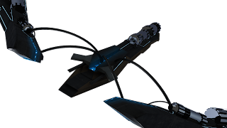
I also played with incandescence maps to create these glowing strips of blue lights on the ships underside. The engines had some funny overlapping geometry and I didn't think of a fix til later so they remained like chrome for a long time, I even toyed with the idea of frosted glass engines... :/
 |
| Predatory Ipod |
I had a lot of fun with the splodgy specular map which controls the shininess of the material, without disrupting the shape of the model you can give the impression of dirt and smears covering up its glossy undercoat.
I finally decided to texture the impossible engines just by moving their UVs over existing parts of the texture that looked particularly mechanical, this worked well and made the texture even more efficient. Oh, and I added some lights, to match the blue incandescence, and because I can't help myself.
 |
| Engines and Lights |
The next one was an evacuation craft and, though it wasn't specifically for medical purposes (as far as I know), I decided to give it the emergency colours of an ambulance or red cross flag. This came across more Templar knight than I intended but I love the effect regardless. I have a feeling it will go through some further revisions before the final version but I'm very happy with its current state regardless.
This looks very Mirrors Edge, with the bright whites, single contrasting colour, and cool blue shadows. Which is nice, but not nearly dirty enough.
This ships material has a more flaky metal, construction site look. But in a noble medieval way? This ship is much more complex in its form and number of pieces, took a while to wrap my head around the UV process and most of it worked really well, but there are a couple of bits I would have done differently now. In future I will plan colour placement before unwrapping, that way if I want a strip of colour, I can unwrap that strip separately, that way avoiding awkward seams and making the base colours very easy to paint.
 |
| Slight Reflectivity |
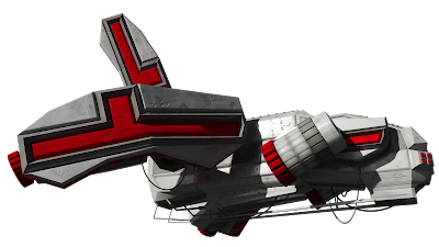
Seeing as this is for live action ultimately I've gone as high end as possible with the textures and shaders. This one is using the mia_material, with glossy reflections and three 8k textures (diffuse/bump/specular). Its glorious. I love the way the bright light bleeds into the shadow in this render below, I think its the reflectivity doing it.
 |
| AO |
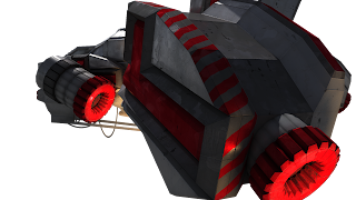 The construction stripes were requested and fit really well with the scratches and flaky metal aesthetic. ( Its not a PixelCrush post unless you I use the word aesthetic at least once.)
Mandatory. I even textured some soot inside the engine exhausts but its not as obvious as I thought it'd be.
...and tweaked away for a bit...
...and called it a day. I'm really pleased with how both came out, and though they use very similar techniques they have quite distinct looks from each other, but without losing all coherence.
I believe this is the first post since the year's wrap up post. I miss the structure. The people. The work. I don't miss the panic, the lack of time, but that's about it.
Pixel Propaganda
Tom Bissell writes goooooood. Here's his take on the evolution of the Mass Effect trilogy and some of its more eccentric characteristics.
E3 happened this week, and there is much I could say about it, but after watching over 12 hours of streamed conferences, demos, and news, I feel pretty numbed. There are certain unpleasant trends in the game industry at the moment which I won't give videogame pessimists the satisfaction of listing them. Suffice to say it has filled me with a powerful need to be creatively different from everything the mainstream games industry produces, and a lot of excitement for a meagre 2 or 3 games.
Here is Michael Abbott's summary of one particularly boring trend, and it's relation to the rise and fall of a specific cinematic genre.
Where as elsewhere, Scandinavians are making fascinating horror games from the perspective of a toddler's imagination. Praise the lord for uniqueness and diversity of creativity.


No comments:
Post a Comment
Let The Discussion Begin: